
The Role of Typography in Your Brand Identity
By the Business in a Box Team
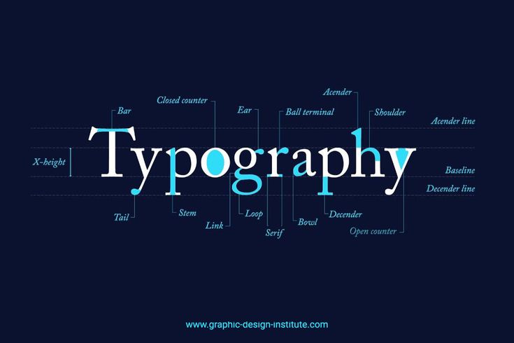
Typography is one of the most overlooked elements of branding, yet it plays a powerful role in how your business is perceived. The fonts you use communicate personality, mood, and professionalism. Long before a client reads your message, your typography sets the tone.
At Business in a Box (BIB), we treat typography as a key part of identity. It is not just about choosing a nice font. It is about selecting a visual voice that supports your brand message.
Fonts Speak Without Words
Every typeface has a personality. Some feel modern and clean. Others feel elegant and refined. Some feel bold and confident.
Your choice of typography influences how people feel about your business. A mismatch between your message and your font can create confusion. A thoughtful match builds trust and clarity.
For example, a professional service using playful fonts may appear less serious. A creative brand using rigid fonts may feel restricted.
Consistency Builds Recognition
Using too many fonts weakens your brand. It makes your communication feel scattered and unorganised.
A strong brand usually relies on a small set of fonts, often:
One primary font for headings
One secondary font for body text
Optional accent use for emphasis
This consistency helps people recognise your brand wherever they see it.
At BIB, we define typography systems that are easy to use and easy to maintain as your business grows.
Readability Always Comes First
Typography should never make reading difficult. No matter how stylish a font is, it must be easy to read across all formats.
Your typography must work on:
Websites
Mobile screens
Business cards
Flyers
Emails
Social media
Good typography balances style with function. It makes information accessible and pleasant to read.
Typography Supports Your Brand Voice
Your brand voice is how you sound. Typography is how that voice looks.
A calm, professional brand benefits from clean and structured fonts. A warm and friendly brand may suit softer typography. A bold brand may use strong, confident typefaces.
When typography aligns with voice, your message feels natural and unified.
Hierarchy Guides Attention
Typography also helps organise information. Headings, subheadings, and body text guide the reader and make content easier to understand.
Clear hierarchy tells people what to read first, what is most important, and where to focus. This structure improves user experience and keeps readers engaged.
Good Typography Feels Invisible
The best typography often goes unnoticed. It feels effortless and smooth. It allows your message to shine without distraction.
When typography is done well, people focus on what you are saying, not how hard it is to read.
BIB Designs Typography That Works
At Business in a Box, we choose fonts with intention. We test them across platforms and pair them carefully with your colours and layout.
Your typography becomes part of a complete visual system that supports your brand consistently and professionally.
Send us an email at info@4dsphere.com to begin your branding journey today. Let us help you create a visual identity where every detail works together.
Typography may seem small, but it carries your message every day. Choose it with purpose.