
How to Choose the Right Colours for Your Brand
By the Business in a Box Team
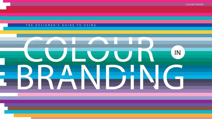
Colour is one of the most powerful parts of your visual identity. It shapes emotion, influences perception, and helps people recognise your brand at a glance. When chosen correctly, your colours tell a story before you say a single word.
At Business in a Box (BIB), we help clients choose colours that reflect their identity and support the message they want to share. Branding is not just about what looks nice. It is about what feels right for your business.
Colour Creates Emotion
People respond to colour long before they read text. Different shades create different feelings. For example, soft neutrals may feel calm and trustworthy. Bright tones may feel energetic and bold. Deep colours may feel strong and professional.
Understanding the emotion you want your clients to feel helps you choose the right palette.
When clients see your brand, should they feel comfort, confidence, creativity, or energy.
Your colours should answer that need.
Know Your Brand Personality First
Before choosing colours, you must understand your brand personality. Are you warm and friendly. Are you calm and structured. Are you expressive and bold.
Your colour choices should reflect this personality. When your colours and identity match, your brand feels complete. When they do not match, your visuals feel confusing or inconsistent.
This is why at BIB, we always define identity before we design. Colour comes after clarity.
Limit Your Palette for Consistency
Many business owners choose too many colours. This leads to inconsistency and a scattered visual presence. A strong brand usually works with a simple palette.
This normally includes:
One main colour
One secondary colour
One accent colour
A set of neutrals for balance
A focused palette creates a clean and professional look. It helps your audience recognise your brand wherever they see it.
Consider Your Industry
Different industries naturally lean toward certain colour families. Health and wellness brands often prefer calm tones. Beauty and lifestyle brands use warm or expressive colours. Business and finance brands lean toward confident and stable shades.
The goal is not to copy others but to understand what your audience expects. Once you know this, you can choose colours that feel familiar and trustworthy while still reflecting your unique personality.
Think About Long Term Use
Your colours should work well across all platforms, from print materials to digital screens. They should look good on your business cards, flyers, website, and social media pages.
Some colours appear beautiful in theory but do not perform well in real use. This is why BIB tests palettes across different formats before finalising your brand.
The right palette feels good everywhere.
Your Colours Must Support Your Message
Colour is not decoration. It is communication.
If your message is about simplicity, bright neon tones may not reflect that. If your message is about energy, muted tones might not express it fully.
Your colours must support the message you want to send, whether that message is strength, joy, calm, or innovation.
Let Us Help You Build a Colour System That Works
Choosing colours is not guesswork. It is a strategic part of building a brand that feels complete and professional.
At Business in a Box, we study your identity, your audience, and your purpose before creating a palette that matches all three.
Send us an email at info@4dsphere.com to begin your branding and visual identity journey today. We will help you choose colours that reflect your story and strengthen your presence.
Your colours should speak before you do. Let us help you choose them with clarity.